A timeless entryway is not assembled from a list of trendy objects; it is built from a balance of three things—practical daily function, a welcoming atmosphere, and a composed visual arrangement. That framing comes from design guidance that treats the entryway as "the first impression, the opening chapter" of a home, a space that should feel intentional and collected rather than crowded or trend-driven. The most useful way to apply this thinking is diagnostic: rather than copying a styled photo, evaluate your own hall against a small set of principles and change only what fails the test. This article sets out those principles and then provides a structured checklist for putting them to work.
The Entryway: Your Home's First Impression
The entryway is more than a passage—it is the space that quietly introduces your personal style to every person who crosses the threshold. Wisteria, a furnishings retailer publishing timeless entryway ideas, puts it simply: the best entryways "aren't crowded with décor or driven by fleeting trends," but are instead layered with pieces that feel intentional and balanced. That dual standard—restraint plus intention—is what makes a design endure.
Interior design educators at the Rocky Mountain College of Art and Design (RMCAD) echo the warning about crowding: many entryways are small, and it is easy to overload them with too much furniture or excessive decor. Their guidance is that entryways should stay open so traffic can flow easily from one room to another. In other words, the aesthetic failure and the functional failure are usually the same failure. A space that is hard to move through also reads as cluttered, which makes the diagnosis simpler than it might seem.
Principle 1: Design for Daily Life (Functionality)
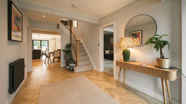
Function comes first because the entryway works harder than almost any other room in the house. It absorbs keys, bags, shoes, coats, and mail, and it must move people in and out without friction. The core functional elements are a place to set things down, a place to sit, and a clear path through the space. A console table anchors the room while providing a surface for styling and a tray or bowl for everyday essentials, as Wisteria suggests—keeping the space both beautiful and usable.
The clearest functional measure is clearance. Building-code guidance compiled by Planner 5D's Kasia Chojecki notes that a standard residential hallway is 36–42 inches wide, with most building codes requiring a minimum of 36 inches; two people can pass at that width, but it feels tight. A comfortable standard runs 42–48 inches, giving breathing room when carrying laundry or passing another person. Homestyler's clearance guide, written by Pranav Saxena, layers traffic level onto this: 36 inches can work for a secondary passage with light traffic, 42 inches or more suits a main circulation route, and 48 inches eases daily movement in a high-traffic family hallway—while storage or display items that project into the corridor should prompt extra width.
Principle 2: Style for the Feeling (Atmosphere)
Once the space works, the question becomes how it feels. Atmosphere is created largely by light. Wisteria's design perspective holds that decorative lighting adds warmth during every season, and that a statement mirror can reflect light to create a sense of openness—an especially valuable trick in a windowless hall. The practical translation: do not rely on a single overhead fixture. A lamp on the console, or a decorative sconce, gives the entrance a softer, layered quality that overhead light alone cannot achieve.
Atmosphere also comes from texture and material. Sculptural accessories, in Wisteria's framing, introduce texture, height, and visual interest—qualities that keep a small space from feeling flat or generic. The timeless part is choosing these elements for how they feel together rather than for a seasonal look: a mirror, a warm light source, and a few textured objects will outlast any single year's color trend.
Principle 3: Guide the Eye (Composition)
Composition is how the eye moves through the space, and its first rule is hierarchy. Let one element lead: a console, a piece of artwork, or a statement light fixture becomes the focal point, and everything else supports it. When several objects compete for first attention, the room feels restless no matter how tasteful each piece is individually.
The second compositional rule is layering balanced by restraint. Wisteria describes layering lighting, art, and accessories to create depth, while RMCAD warns that the opposite instinct—overcrowding—is the most common entryway mistake. These two ideas resolve into one practice: combine a few varied elements for richness, and deliberately leave empty surface and wall space so the pieces you love stand out. Negative space is not wasted space in an entryway; it is what makes the chosen objects legible.
Your Timeless Entryway Diagnostic Checklist
Walk your entryway with a tape measure and this table. For each row, record what you find; every row that fails becomes an item on your improvement list. The numbers and principles come from the design guidance above, so each finding maps directly to a fix.
| Principle | What to Check | Standard to Meet | If It Fails, Do This |
|---|---|---|---|
| Functionality | Clear walking path through the space | 36 inches minimum; 42–48 inches for a main or high-traffic route (Planner 5D; Homestyler) | Remove or relocate any furniture that narrows the corridor below the target width |
| Functionality | A surface for daily drop items (keys, mail, wallet) | A console table or shelf with a tray or decorative bowl for essentials (Wisteria) | Add a narrow console or wall shelf; corral loose items into one tray |
| Functionality | Visual crowding | Open space preserved so traffic flows easily | Subtract decor first; edit until movement and sightlines feel easy |
| Atmosphere | Lighting scheme | Warm, decorative lighting in every season rather than overhead alone (Wisteria) | Add a table lamp or sconce; check that the entry reads warmly lit at dusk |
| Atmosphere | Light reflection and openness | A statement mirror reflecting light (Wisteria) | Place or hang a mirror where it bounces light into the hall |
| Composition | Focal point | One leading element—console, artwork, or statement fixture (Wisteria) | Choose the anchor piece and demote competing objects to supporting roles |
| Composition | Layering and texture | Depth from varied elements—light, art, textured accessories (Wisteria) | Introduce one or two sculptural objects with height or texture |
Notice how the rows interlock: the clearance measurement is functional, but the openness it protects is also what the composition rows depend on. A hall that passes the pathway test but fails the crowding test usually needs editing, not adding.
Transforming Your Entryway: A Step-by-Step Approach
Prioritize improvements based on the diagnostic checklist, starting with functional needs and then enhancing atmosphere and composition. In practice this means a clear order of operations: first measure the path and remove anything that obstructs it; then establish the drop surface so daily clutter has a home; then add warmth through lighting and a mirror; only last, choose the focal point and layer a few textured accessories around it. Working in this sequence prevents the common mistake of decorating a space that still does not function—an error RMCAD identifies as the overcrowding trap.
The measurable indicator of success is threefold: a noticeable reduction in clutter, improved traffic flow through the measured pathway, and a more inviting, aesthetically cohesive feel upon entering the home. You can check all three objectively after a weekend of changes—remeasure the walking path against the 36-inch minimum and the 42–48-inch comfort target, count the loose items without a designated tray, and view the space at dusk with only the decorative lighting on. An entryway that passes those three checks will not just photograph well; it will welcome you every single day, which is the definition of a design that lasts.
Sources
- Revamping Entryways: First Impression in Interior Design - RMCAD
- Refresh Your Entryway: 3 Timeless Entryway Design Ideas — Wisteria
- How Wide Should a Hallway Be? Size Guide for Homes — Decor and Interior Design Blog - Planner 5D
- Standard Hallway Width: A Practical Guide to Clearances — Homestyler