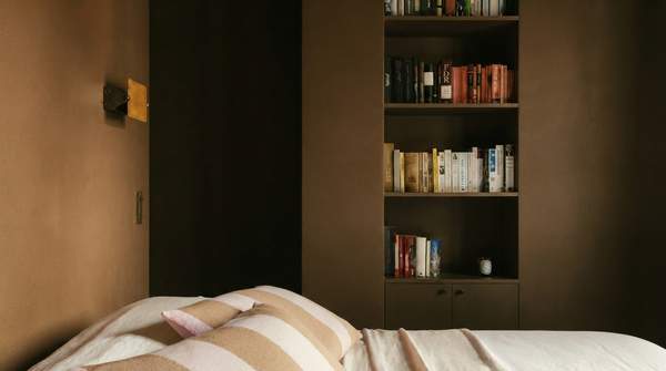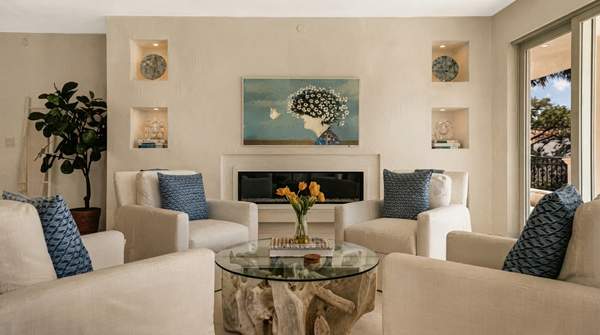
The best color for a reading nook is not the one that photographs well—it is the one that matches what you do in the chair. If you study dense texts, cool blues and muted greens are the evidence-backed choice, because research on learning environments links them to sustained attention, accuracy, and reduced eye strain. If you read to unwind, deep blues and warm plums create what designers at the Interior Design Institute call a "snug, enveloping feel." And if you read to spark ideas, warm yellows and oranges have been associated with optimism and creative thinking. The palette should follow the activity, not the other way around.
Colors for Deep Focus and Study
When your reading goal is concentration—working through complex texts, studying, or anything that demands hours of sustained attention—cool colors do the heavy lifting. Writing on color in educational spaces, Leah Docea of Design Collaborative reports that cool colors reduce sympathetic nervous system activity, the body's fight-or-flight response, and calm the body overall. The research she cites is specific: blue supports accuracy and sustained attention, while green improves reading comprehension and reduces eye strain.
That combination matters for a study-oriented nook. Accuracy and sustained attention are exactly the cognitive states that dense material demands, and reduced eye strain directly extends comfortable reading sessions. Docea also notes that people working in cooler-toned environments stay "in the zone" longer, and that such spaces even feel quieter—occupants naturally lower their voices.
Application matters as much as hue. Docea's guidance for focused spaces favors matte textures, soft upholstery, acoustic felt, and light washes of color over bold painted walls. In a home nook, that translates to muted greens and soft blues carried through upholstery and wall treatments rather than saturated feature walls. The goal is a calm field, not a statement.
Colors for Relaxed Leisure Reading
Leisure reading asks for something different: immersion rather than vigilance. Here the evidence points to rich, deep hues. The Interior Design Institute's guidance on color psychology singles out exactly this context, noting that "rich hues like deep blues or warm plums are perfect for areas where a snug, enveloping feel is desired, such as in home theatres or reading nooks."
The mechanism is partly perceptual. Cool tones like blue promote relaxation, while warm tones energize—and for a nook meant for winding down, the calming side of the spectrum wins. Depth perception plays a role too: the Institute notes that cool colors recede, pushing walls away and expanding perceived space, while warm colors advance. A deep blue or plum can therefore wrap the reader in enclosure without the room feeling smaller in an oppressive way.
Warm neutrals—muted browns, soft plums—work on the same principle by dialing arousal down and coziness up. If your reading time is escape time, the palette should signal safety and softness. That is the psychological job of these hues, and it is why they dominate cozy-nook palettes.