Color in interior design is more than a decorative choice; it is a powerful medium that profoundly shapes emotions, perceptions, and the overall atmosphere within a home. Deliberate color selections can create spaces that deeply resonate with psychological needs, influencing whether an environment feels calm, energetic, intimate, or expansive. Understanding how specific hues, their saturation, and brightness interact with human psychology allows for intentional design that enhances well-being and functionality.
The Psychology of Color in Interior Design
The impact of color on human behavior and experience is a vital aspect of interior design. As color psychology expert Karen Haller explains in *The Little Book of Colour*, understanding how color is processed by the brain can trigger emotional and physiological responses, shifting mood, energy, and interaction within a space, as reported by Livingetc. This means that interior color can significantly affect residential satisfaction and psychological and social functioning, extending beyond mere aesthetic value, according to research published in *PMC*.
The influence of color is nuanced, with factors such as saturation, brightness, and context playing crucial roles. A vivid red wall, for instance, might invigorate a kitchen but could feel overwhelming in a bedroom, while a gentle pastel blue might evoke tranquility in an office but appear chilly in a living room, notes Belysse. Generally, warm colors tend to stimulate and enliven, while cool colors offer relaxation and immersion. This knowledge empowers designers and homeowners to choose colors that optimize the user experience in specific settings, creating environments that not only look good but also feel good.Cool Colors: Calming, Expansive, and Focused
Cool tones, including blues, greens, and soft grays, are widely recognized for their ability to lower perceived stress and promote mental quiet. These colors are frequently used in bedrooms, libraries, and private retreats to foster a sense of tranquility.
* Blue: Lighter and desaturated blues, such as sky blue and duck egg blue, are soothing and restful, making them ideal for spaces where relaxation is key, like bedrooms, where they can promote restful sleep and create a tranquil atmosphere. These soft blues are widely considered calming colors for anxiety and stress, according to Sherwin-Williams. Darker blues, like navy and teal, can aid in focusing the mind, making them suitable for home offices or areas requiring concentration, as Livingetc highlights. Spatially, cool colors tend to recede, pushing walls away and expanding the perceived space, which can make a room feel larger and more open, according to The Interior Design Institute.
* Green: Associated with nature, balance, and harmony, green creates a refreshing atmosphere and promotes mental quiet. The Interior Design Institute suggests that shades of green can contribute to a focused yet calming environment. Green's effects are generally consistent across various shades, often linked to its natural associations, as noted by Sherwin-Williams and Belysse.Warm Colors: Energizing, Intimate, and Stimulating
Warm tones, such as reds, yellows, and oranges, carry social energy and tend to stimulate and energize. They encourage gathering, conversation, and a sense of physical warmth, drawing people toward the center of a room, according to Garret Cord Werner Architects & Interior Designers.
* Red: Deep and saturated reds evoke passion, excitement, energy, and warmth. They can stimulate conversation and appetite, making them suitable for dining areas or social spaces. The Interior Design Institute notes that warm tones like red energize a space. These bold reds can also make a room feel more intimate and inviting, as they tend to advance visually, pulling walls closer and creating a snug, enveloping feel, according to The Interior Design Institute and Garret Cord Werner Architects & Interior Designers. Sherwin-Williams suggests that reds are designed for intimate and cozy settings.
* Yellow: Bright and high-saturation yellows are associated with happiness, energy, and cheerfulness. They can stimulate appetite and creativity, making them suitable for kitchens or creative spaces. Sherwin-Williams notes that yellow reflects light and stimulates the logical side of the brain, fostering creativity and excitement. Yellow's resemblance to the sun can also make onlookers feel awake and active. By reflecting light, vibrant yellows can contribute to a sense of expansiveness, particularly in smaller spaces, as inferred from Sherwin-Williams' observations.
* Orange: Described by Sherwin-Williams as friendly and welcoming, oranges radiate warmth, happiness, and rejuvenation. They are ideal for gathering spaces like family rooms or children's bedrooms, combining the uplifting energy of reds with the spirited tone of yellows, and can even have a slight impact on appetite.
Applying Color Psychology to Common Home Spaces
Incorporating color psychology into interior design allows for the creation of spaces tailored to evoke specific moods and functionalities. However, color perception changes when furniture, decor, and lighting are introduced, so it is important to reassess the palette after installation to confirm it maintains the intended mood and proportion, advises ArchiVinci. Environmental factors also play a role; north-facing rooms tend to make colors appear cooler and darker, while south-facing rooms amplify warmth and brightness, making it critical to test colors in the specific room at different times of day before committing, according to HomeDesignsAI.
Here's how to apply these principles to common home areas:
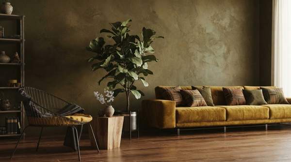
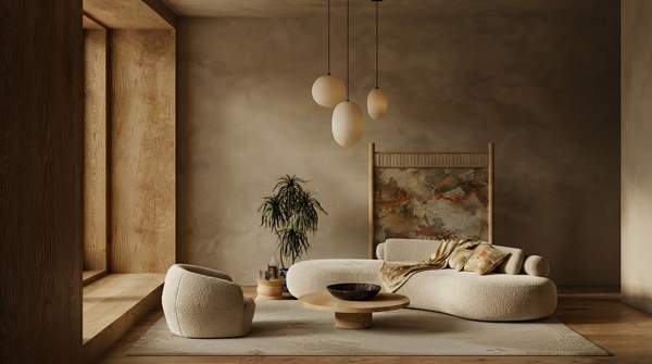
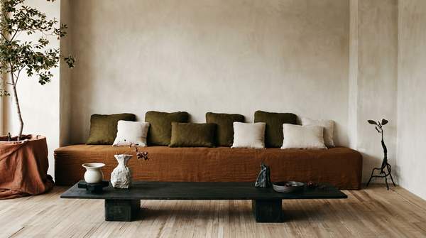
* Living Room: To create a welcoming atmosphere that encourages social interaction and relaxation, The Interior Design Institute suggests opting for a warm color palette with neutral bases like creams or taupes, enlivened by accent colors such as ochre or emerald green.
* Bedroom: For a calm and restful environment, soft greens and blues are soothing choices. Sherwin-Williams identifies blues as calming colors for anxiety and stress, while The Interior Design Institute suggests that rich hues like deep blues or warm plums can create a snug, enveloping feel, suitable for areas where intimacy is desired.
* Home Office: To foster focus and creative thinking, shades of blue and green can create a focused yet calming environment. Accents in citrus tones or vibrant coral can invigorate the space and encourage creativity, according to The Interior Design Institute. Darker blues, such as navy and teal, are also beneficial for concentration, as Livingetc notes.
* Kitchen: This space should inspire culinary creativity and foster family interactions. The Interior Design Institute recommends warm colors like yellow and orange to stimulate appetite and bring energy, balanced with touches of cooler green for freshness and vibrancy.
By thoughtfully considering the emotional and spatial effects of different color families, along with their saturation and brightness, homeowners can intentionally design their living spaces to support desired moods and activities.